LLNL expands release of energy flowcharts

August 24, 2020, 12:24PMNuclear News

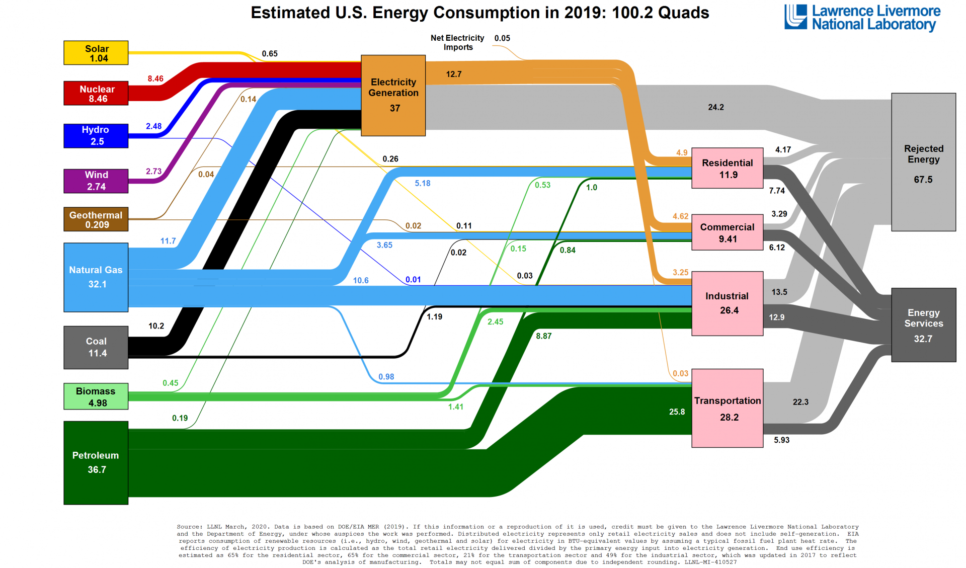
This flowchart is housed in a library of Sankey diagrams at flowcharts.llnl.gov and is also available as a PDF. Source: Department of Energy/LLNL, based on EIA data

Every year, Lawrence Livermore National Laboratory releases flowcharts illustrating U.S. energy consumption and use. The flowcharts, called Sankey diagrams, allow scientists, analysts, and other decision makers to compare the contributions made by various energy sources, including nuclear power, and the end uses of those sources, including residential, industrial, commercial, and transportation markets. Taken as a series of annual snapshots, energy use trends and opportunities quickly become apparent.

This year, in addition to releasing the 2019 energy flowchart, the lab issued state-by-state energy flowcharts for 2015–2018 and carbon emissions charts for 2014–2017. It is currently at work on charts of international energy use that it hopes to release by the end of the year.

What’s a Sankey diagram? The flowcharts pack a lot of quantitative data into a single-page graphic. Read from left to right, they contain information about resource, commodity, and by-product flows, and interwoven resource streams help clarify the nation’s complex system of energy use.

LLNL staff have produced a video called “Everything You Need to Know about the Energy Flowcharts” in which they explain that “energy services” represent an energy commodity being put to use, while the inevitable loss of low-temperature heat to the environment is “rejected energy.” While any process of energy conversion and use will result in rejected energy, improved end-use technologies—such as efficient engines, lighter cars, and LED bulbs—can reduce the amount of rejected energy because they demand less energy than the technologies they replace.

The data: LLNL produced the first diagrams illustrating U.S. national commodity use in the mid-1970s. LLNL charts U.S. energy use in quads, based on data from the U.S. Energy Information Administration. One quad is 1 quadrillion BTUs, or British thermal units (there are 3,412 BTUs in 1 kWh). The United States consumed 100.2 quads of energy during 2019. By comparison, 2018 saw the greatest U.S. energy use so far, at 101.2 quads.

In addition to energy use, LLNL has published charts depicting carbon (or carbon dioxide potential) flow and water flow at the national and state levels.

What can the charts tell us? At a glance, the state charts provide an overview of the spectrum of resources each state uses to produce electricity and indicate whether a state is an electricity importer or exporter. Compare 2018 energy use flowcharts for Illinois, Iowa, and California, for example: Illinois generates more than 50 percent of its electricity from nuclear power and is an electricity exporter; Iowa, also an electricity exporter, gets the bulk of its electricity from wind and coal; and California relies on eight energy resources and out-of-state imports to meet its electricity needs.

While the entire output of U.S. nuclear power plants currently feeds into electricity generation, a close look at LLNL’s Sankey diagrams makes it easy to see a role for nuclear power in integrated energy systems that send some of that energy directly to industrial process heat customers, bypassing the grid.


Related Articles

U.S., Indonesia partner on SMRs

March 28, 2023, 12:01PMNuclear News

The United States and Indonesia have announced a strategic partnership to help the latter nation develop its nuclear energy program, supporting its interest in deploying small modular reactors...

Canada proposes tax credits for SMRs

November 11, 2022, 12:00PMNuclear News

The Canadian government last week released its 2022 Fall Economic Statement, featuring, among its many proposals, investment tax credits for a variety of clean energy technologies, including...